




 800+ agencies
Get 3 interested buyers from LinkedIn in 30 days, or get the next 3 months free
Book a call, we build your campaign, and it goes live within 48 hours. Free to start. 100% success rate so far.
 5 build-call places left this week · 21 booked in the last 2 days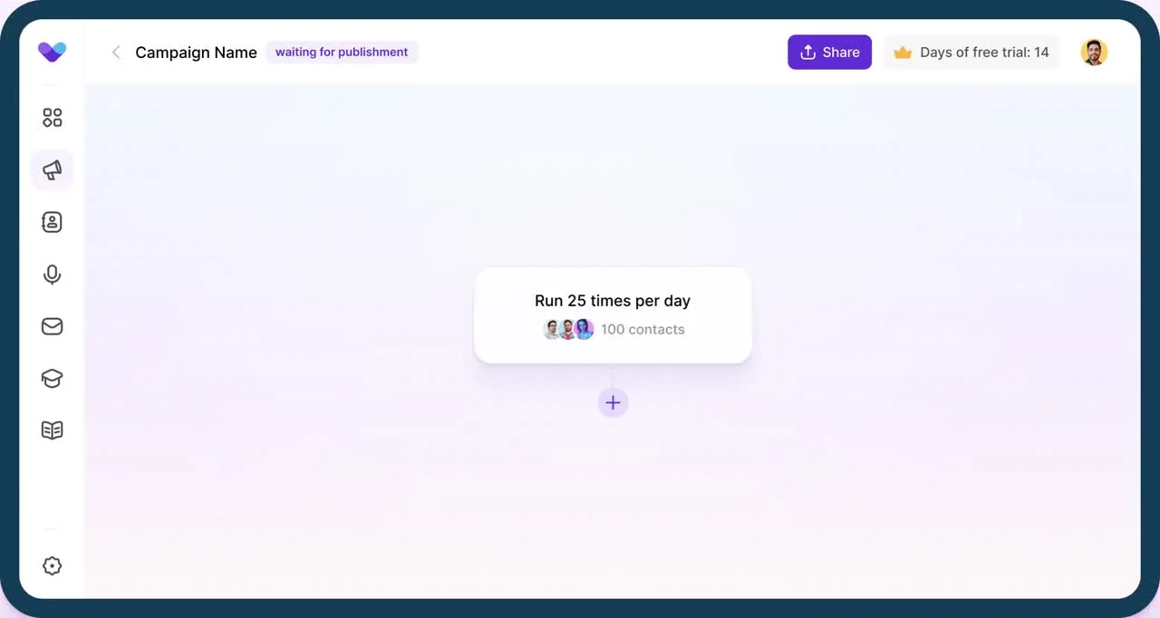
Get 3 interested buyers from LinkedIn in 30 days, or get the next 3 months free
Book a call, we build your campaign, and it goes live within 48 hours. Free to start. 100% success rate so far.
5 build-call places left this week · 21 booked in the last 2 days






How do you run LinkedIn outreach today?
Pick one and we’ll show you how Prosp fits the way you already work.
Replies that feel human, not automated
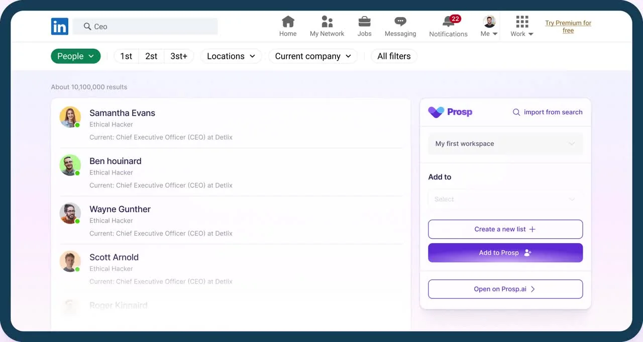

Search by title, company and activity, or import a list. Prosp reads each profile and recent posts before writing a word.

Each message is written for the prospect. Clone your voice once and Prosp sends AI voice notes that sound like you.
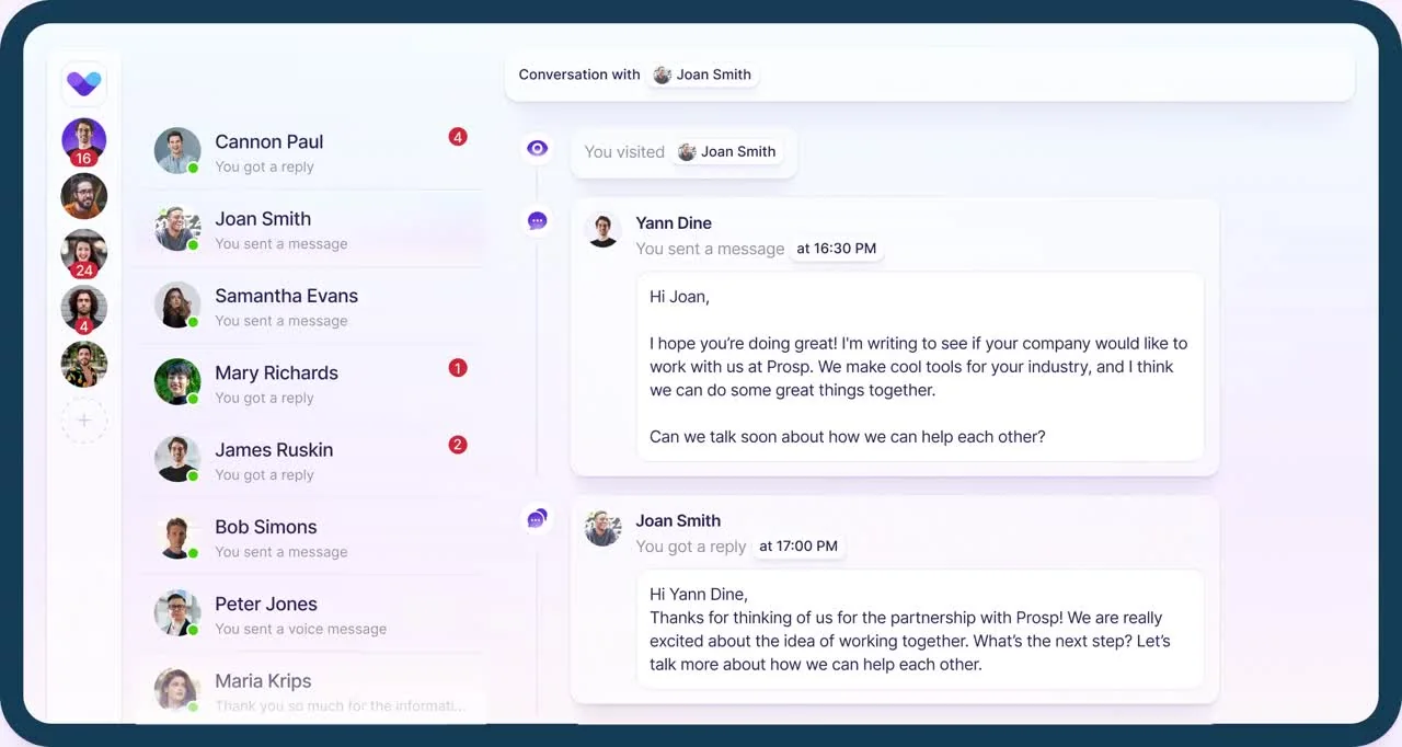

Every reply from every account and every client lands in one inbox. You take the calls.
 Every connected account gets its own dedicated residential proxy and paces activity like a human. Nothing runs from your laptop.

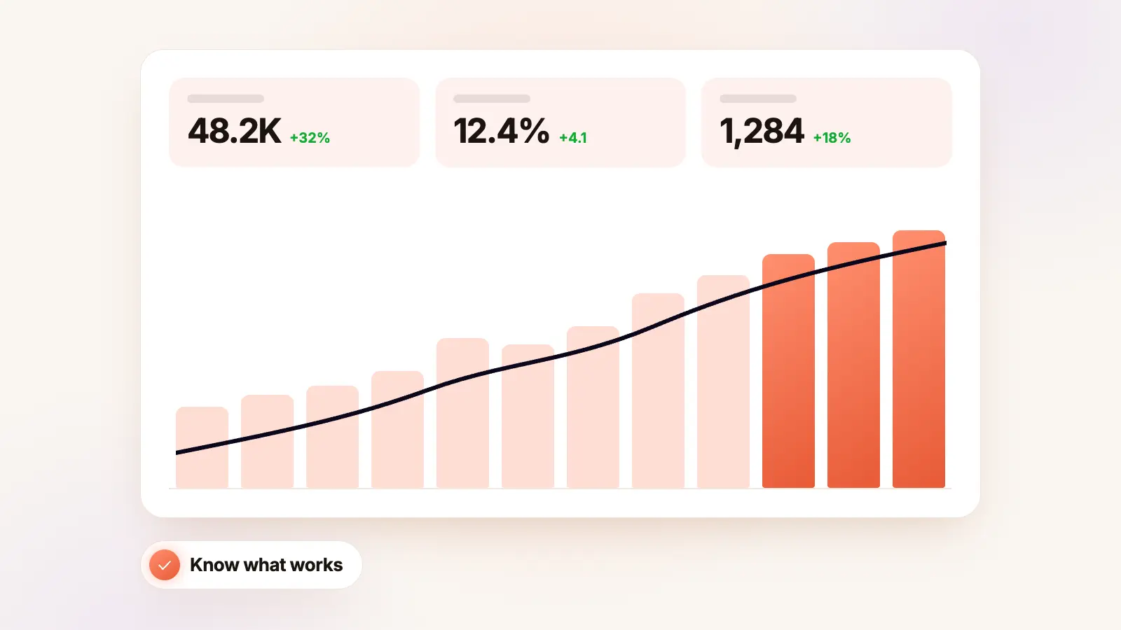
Claude charts turns a pasted table into an interactive, filterable visual in a single prompt. But feed it the wrong input and you get a broken output - or worse, a chart that…
From agencies already running it
 5/5 Rated on Capterra



Get 3 interested buyers from LinkedIn in 30 days, or the next 3 months free
Book a build call with our LinkedIn expert. Your campaign goes live within 48 hours and sends for 30 days. 5 places left this week, closing Friday.

 Yes, book my build call with LinkedIn expertLive within 48 hours · Offer closes Friday · Cancel anytime